

By Hubert, July 18, 2023 · 6 min read
React and Shadcn UI - a Match Made in Heaven?
Many well-known UI libraries have been built, such as MUI, Ant Design, and Chakra UI, providing developers with pre-built components that they can easily integrate into their applications. In this article, we'll take a closer look at Shadcn UI - a UI tool that takes a different approach than the others.
1. What is Shadcn UI?
Shadcn UI, unlike other popular solutions, is not a component library. As the author of this tool mentions in the documentation, it is a collection of reusable components that we can copy and paste into our application. Shadcn UI is built on top of Tailwind CSS and Radix UI, a low-level library consisting of various user interface components. Its priority is to provide accessibility, customisability and developer experience.
2. Why use Shadcn UI?
Shadcn UI focuses on accessibility and includes components such as buttons, menus, dialogs, tooltips, and more, that are designed to be fully accessible and usable by all users, including those with disabilities. This way we don't have to reinvent the wheel. In addition, these components adhere to the Web Content Accessibility Guidelines (WCAG) and provide keyboard navigation, screen reader support, and other accessibility features out of the box.
One of the many advantages of the Shadcn UI is that we add components to our project using copy/paste. Why is this a good thing?
The underlying concept of this approach is to empower you with ownership and granular control over the codebase, granting you the freedom to shape and style the components according to your unique preferences and requirements. Packaging components in an npm package offers convenience and reusability, but it comes with a drawback. The coupling of styles with implementation limits flexibility and hinders separation of concerns. To prioritize modularity and maintainability, it's vital to decouple component design from implementation. This enables easier updates, scalability, and style swapping without affecting core functionality. Another notable and compelling aspect that sets Shadcn UI apart is its remarkable ease of component customization.
With Shadcn UI, developers can easily tailor the look and feel of each component, ensuring that it harmonizes with their application's overall design language.
3. How to use Shadcn UI
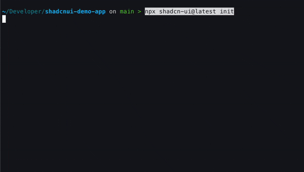
As an example demonstrating the use of Shadcn UI, I will create a simple view of the product details page. Using Shadcn UI is very simple. If you want to implement it in your project, just use the dedicated CLI that initializes the tool. The CLI will ask you to define a few configuration values such as the base color, the locations of the main CSS file, and import aliases.
components.jsonutils.tstailwind.config.jsNow let's consider what components we need to create a simple product page. Not counting the basic elements, such as images and texts, let's implement:
- Variant selector
- "Add to cart" and "Add to wishlist" buttons
- Accordion with product and order details
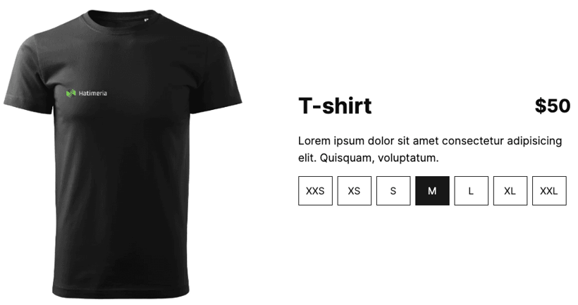
Let's start with the variant selector. A Radio Group seems ideal for this, which, when personalized, will meet the objectives of the variant selector. So let's add the Radio Group to the project.
We can do this in 2 ways:
- Copy the component from the documentation
- Use the CLI, which will place the component in the right place and install any required npm packages. I find it easier to utilize CLI, so let’s go with this way.
radio-group.tsxsrc/app/components/ui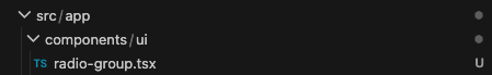
radio-group.tsxNow all you have to do is just use the components
The result:
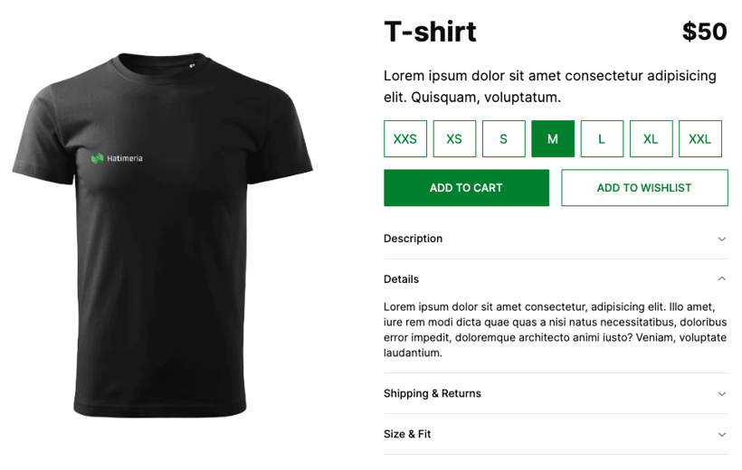
Now let's add the remaining elements: Buttons and Accordion with product and order details.
Let's use the Button and Accordion components. After using the CLI, simply and quickly customizing the components, I was able to implement the needed elements without any problems. Our JSX looks as follows:
The result:
4. How to customize Shadcn UI components
The author of Shadcn UI has thought very well about theming and the ability to customize components. Again, it is very simple. Depending on whether you use Tailwind CSS utility classes or CSS variables for theming, the approach will be slightly different. In this case, I refer you to Shadcn UI documentation. After changing a few lines of code, our product details page can look as follows:
Creating a fully accessible, functional and good looking basic product details page took me literally minutes - this is amazing!
5. Conclusion
Shadcn UI is becoming increasingly popular in the UI development community due to its accessibility, customizability, and ease of use. Using Shadcn UI can not only accelerate the development process but also improve the overall design and accessibility of an application. By providing reusable components that adhere to accessibility standards and offering granular control over the codebase, Shadcn UI empowers developers to create UIs that are not only visually pleasing but also accessible to users with disabilities.
Would you like to innovate your ecommerce project with Hatimeria?

An MMA enthusiast and code ninja. He has a black belt in both coding and roundhouses. When he is not delivering top-notch software, he can be found at the gym, honing his skills and training for his next fight.